
Adaptive web design is a development approach that builds multiple fixed layouts, each tailored to a specific device category, and serves the most appropriate version based on device detection at the moment of page request. Unlike responsive design, which uses a single fluid layout that reflows continuously, adaptive design selects from discrete, pre-built templates. For web developers, designers, and small business owners, this distinction matters because it determines how much control you have over the exact experience each user receives. This article covers the adaptive design definition, how it works technically, its benefits, how it compares to responsive design, and when it makes sense to use it.
What is adaptive web design and how does it work?
Adaptive web design builds multiple fixed layouts and selects the best-fit version based on device characteristics at the moment of the page request. The server or browser detects the device type, screen size, or capabilities, then delivers the matching pre-designed template. No fluid reflow happens. The user gets a layout built specifically for their context.
The most common implementation uses six standard breakpoints:
- 320px — small smartphones (older iPhones, budget Android devices)
- 480px — larger smartphones in portrait orientation
- 760px — tablets in portrait mode and large phones in landscape
- 960px — tablets in landscape and small laptops
- 1200px — standard desktop monitors
- 1600px — wide-screen and high-resolution displays
Each breakpoint has its own pre-designed layout. When a request comes in, the detection mechanism reads the device's User-Agent string or screen dimensions and routes the user to the correct template. This is fundamentally different from responsive design, which uses CSS media queries and fluid grids to stretch or compress one layout across all sizes.
Detection can happen on the server side or the client side. Server-side detection reads the HTTP request headers before the page loads, which means the correct template is sent immediately. Client-side detection runs JavaScript after the page loads, which can cause a brief layout flash if the wrong template renders first. Server-side rendering in adaptive design should choose the correct template before sending the page to avoid visible layout switches upon hydration. This is a detail many developers overlook until users start reporting flickering on load.

Advanced implementations go beyond screen size. Tools like DeviceRouter detect real device capabilities including CPU speed, available memory, and network connection quality, then adapt the serving strategy accordingly. A low-end Android phone on a 3G connection can receive a stripped-down template with deferred heavy components and reduced animations, while a high-end desktop on fiber gets the full experience.
Pro Tip: Use User-Agent Client Hints instead of legacy User-Agent string parsing. Client Hints improve detection accuracy and support progressive enhancement strategies, which means your detection logic stays reliable as new device categories emerge.
Benefits of adaptive web design for performance and UX
The core advantage of adaptive design is precision. You are not asking one layout to serve every context. You are building the right tool for each job.
Key benefits include:
- Device-specific content delivery. Adaptive design can serve different content per device class, not just differently arranged styling. A mobile template can omit a complex data table entirely and replace it with a summary card. A desktop template can include an interactive sidebar that would be unusable on a 320px screen.
- Performance gains through asset control. By transferring only necessary assets per device, adaptive design improves load performance compared to responsive in many scenarios. A mobile layout does not download a 2MB hero image sized for a 1600px monitor. It requests a 400px version instead.
- Optimized navigation patterns. Touch-based navigation on mobile and hover-based navigation on desktop are genuinely different interaction models. Adaptive design lets you build each correctly rather than compromising both.
- Legacy system modernization. Older sites with rigid desktop layouts can be given a mobile-optimized layer without rebuilding the entire codebase. This is a practical path for small businesses that cannot afford a full rebuild.
Pro Tip: Pair adaptive layout delivery with image optimization practices at the template level. Serving the right layout means nothing if every template still loads oversized images.
The performance argument is especially relevant for mobile-first strategies. Mobile users are more likely to abandon a page that loads slowly or presents a cluttered interface. Adaptive design addresses both problems at the source by delivering a purpose-built experience rather than a scaled-down one.
Adaptive vs responsive web design: key differences and when to use each
Responsive design uses fluid grids and continuous adjustment; adaptive design uses fixed layouts for specific device breakpoints. That sentence captures the technical difference. The strategic difference is larger.
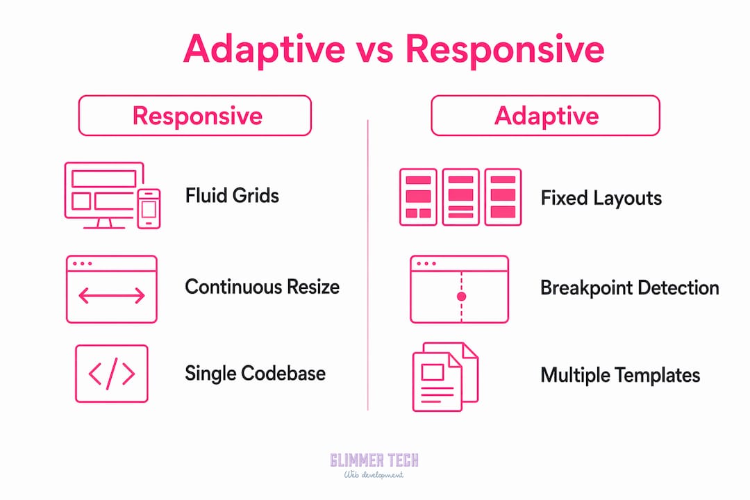
| Factor | Responsive design | Adaptive design |
|---|---|---|
| Layout approach | Single fluid layout, continuous reflow | Multiple fixed layouts, discrete selection |
| Content per device | Same content, different arrangement | Can serve entirely different content |
| Codebase | One codebase, one set of templates | Multiple templates to maintain |
| Performance control | Limited asset control per device | Full control over what each device receives |
| Best for | New projects, content-focused sites | Legacy modernization, performance-critical sites |
| SEO complexity | Simpler, Google-preferred default | Requires careful URL and canonical tag management |
The maintenance difference is real. Responsive design means one codebase. Adaptive design means multiple templates, and every content update potentially needs to be applied across all of them. For a small business owner managing their own site, that overhead is a genuine cost. For a development team building a high-traffic e-commerce platform where mobile conversion rates directly affect revenue, that overhead is worth paying.
Adaptive design is preferable when mobile and desktop experiences require fundamentally different content or interactions. A banking app that shows a simplified transaction list on mobile and a full analytics dashboard on desktop is a clear case. A blog that reflows its text and resizes its images is not.
The insight that clarifies the choice: adaptive design optimizes what is served per device, while responsive design optimizes how a single layout behaves. If your problem is behavior, use responsive. If your problem is content and capability, use adaptive.
Responsive design is recommended as the default for most new projects, but adaptive design remains the right call for legacy modernization and performance-specific use cases. Knowing which situation you are in before you start building saves significant rework later. If you are planning a full rebuild, the website redesign process is a good place to think through that decision systematically.
Practical tips for implementing adaptive web design
Getting adaptive design right requires more than picking breakpoints. The implementation details determine whether users get a polished experience or a broken one.
- Nail device detection before anything else. Accurate device detection is the foundation. If your detection logic misidentifies a tablet as a desktop, the user gets the wrong template. Test detection across a wide range of real devices, not just browser emulators. Emulators lie.
- Use server-side detection to prevent layout flash. Client-side detection runs after the page loads, which means the browser may briefly render the wrong template. Server-side detection sends the correct template from the start. This matters most on first load and on slower connections.
- Build a content governance process for multiple templates. Every template is a maintenance surface. When you update a product description or a call-to-action, you need a process that applies that change across all relevant templates. Without this, templates drift apart and users get inconsistent information depending on their device.
- Integrate with modern frameworks carefully. React hooks and Next.js support server-side rendering patterns that work well with adaptive design. The key is ensuring the template selection logic runs before hydration, not after. Libraries like "use-breakpoint-agent` are built specifically for this pattern.
- Plan for edge cases from the start. Foldable phones, tablets with detachable keyboards, and browsers with unusual viewport settings all fall between standard breakpoints. Define a fallback template and a fallback detection rule before launch, not after your first support ticket.
Pro Tip: Hybrid approaches combining responsive fluid grids with adaptive content switching give you the best of both strategies. Use responsive layout for the structural shell and adaptive logic to swap out specific content blocks per device class. This reduces template maintenance while preserving content control.
Balancing upfront development costs against long-term benefits is the honest conversation every project needs. Adaptive design costs more to build and more to maintain. The return on that investment depends entirely on whether your users' mobile and desktop needs are genuinely different.
Key takeaways
Adaptive web design delivers device-specific layouts through detection-based template selection, giving developers precise control over content, assets, and interactions that responsive design's single-layout approach cannot match.
| Point | Details |
|---|---|
| Core definition | Adaptive design builds multiple fixed layouts and serves the correct one based on device detection. |
| Standard breakpoints | Common widths are 320, 480, 760, 960, 1200, and 1600px, each with its own pre-built template. |
| Key advantage over responsive | Adaptive can serve entirely different content per device, not just a rearranged version of the same content. |
| When to choose adaptive | Use it when mobile and desktop require fundamentally different content, interactions, or performance profiles. |
| Main maintenance trade-off | Multiple templates mean higher upkeep. Build a content governance process before launch to keep templates consistent. |
Adaptive design in 2026: what I actually think
After working on web projects across a range of industries, my honest view is that adaptive design is underused in exactly the situations where it would make the biggest difference, and overused in situations where responsive design would have been simpler and cheaper.
The cases where adaptive genuinely wins are not subtle. A logistics company whose drivers use the mobile site to scan shipments and whose office staff use the desktop site to run reports needs two different products, not one product that reflows. Responsive design cannot solve that problem. Adaptive design can.
What I find most interesting in 2026 is the hybrid approach. Pure adaptive design with six fully separate templates is a heavy commitment. But using a responsive shell with adaptive content switching at the component level is practical for teams of almost any size. You maintain one structural codebase and swap specific blocks based on device class. The mobile user gets a simplified checkout flow. The desktop user gets the full product comparison tool. Neither user gets a compromised version of the other's experience.
The mistake I see most often is treating this as a purely technical decision. It is a content strategy decision first. Before you write a line of detection code, you need to answer one question: do your mobile and desktop users need the same information in the same order, or do they need different things entirely? The answer to that question tells you which approach to use. Everything else follows from it.
— Annie
How Glimmer Tech builds adaptive web experiences

Glimmer Tech builds websites that perform across every device your customers use. Whether you need a full adaptive design implementation with device-specific templates or a hybrid approach that combines responsive structure with adaptive content logic, the team at Glimmer Tech has the technical depth to get it right. Every project starts with understanding how your users actually behave on mobile versus desktop, then building the architecture that serves both groups well. If you are ready to move beyond a one-size-fits-all site and into a design strategy built around real device diversity, Glimmer Tech delivers results you can measure.
FAQ
What is the adaptive design definition in simple terms?
Adaptive web design is a method that creates multiple fixed layouts for different device types and automatically serves the correct one based on device detection. It differs from responsive design, which uses a single fluid layout that adjusts continuously.
How does adaptive web design differ from responsive design?
Responsive design uses fluid grids and CSS media queries to reflow one layout across all screen sizes. Adaptive design selects from several pre-built fixed templates based on the detected device, allowing entirely different content and interactions per device class.
What are the main benefits of adaptive web design?
The primary benefits are precise performance control, device-specific content delivery, and optimized navigation patterns. Adaptive design lets you serve only the assets each device needs, which reduces load times compared to a responsive layout that downloads everything.
When should you choose adaptive over responsive design?
Choose adaptive design when your mobile and desktop users need fundamentally different content or interactions, not just a rearranged version of the same page. It is also the practical choice for modernizing legacy desktop sites without a full rebuild.
What breakpoints does adaptive web design use?
The six standard adaptive breakpoints are 320px, 480px, 760px, 960px, 1200px, and 1600px. Each breakpoint corresponds to a pre-designed template that is served after the device detection step confirms the user's screen size or device category.