
If a potential client searches for a contractor on their phone and your site loads slowly, displays broken layouts, or buries your contact number, they move on. Fast. Construction website mobile optimization is how you stop that from happening, and it matters more than most contractors realize. Google now uses your mobile site as the primary version it reads and ranks. That means your desktop experience is essentially secondary. This guide walks you through the foundation, the fixes, the common mistakes, and how to keep your site performing well long after launch.
Table of Contents
- Key Takeaways
- Construction website mobile optimization: what to do first
- Step-by-step fixes for mobile performance and user experience
- Common mistakes that break mobile performance
- Verifying and monitoring improvements over time
- My honest take on mobile optimization for construction sites
- Get your construction site mobile-ready with Glimmer Tech
- FAQ
Key Takeaways
| Point | Details |
|---|---|
| Mobile-first indexing is standard | Google ranks your mobile version first, so weak mobile performance hurts your overall search ranking. |
| Responsive design is non-negotiable | A site that adapts to any screen size is the baseline requirement before any other optimization works. |
| Core Web Vitals define the bar | Your site must hit LCP under 2.5s, INP under 200ms, and CLS under 0.1 to compete in search. |
| Images are the biggest performance threat | Unoptimized photos and project galleries cause the most mobile speed and layout problems on construction sites. |
| Monitoring must be ongoing | One-time fixes are not enough. Performance degrades with every content update if you are not watching it. |
Construction website mobile optimization: what to do first
Before making any changes, you need a clear picture of where your site stands. The industry term for the technical foundation here is responsive web design. A responsive construction website automatically adapts its layout and content to fit any screen size. Without it, no amount of speed work will produce a mobile-friendly result. Responsiveness is the prerequisite, not a bonus feature.
Start with three free tools that give you real data fast.
- Google Search Console shows you how Google's crawler sees your mobile pages, including any usability errors it has found.
- PageSpeed Insights gives you a mobile performance score alongside specific fixes ranked by impact.
- Chrome DevTools lets you simulate different phone screen sizes directly in your browser to spot layout problems before users do.
Once you have access to these tools, you need to understand what you are measuring. Google evaluates mobile sites using Core Web Vitals, which are three specific performance metrics. LCP (Largest Contentful Paint) measures how fast your main content loads and must be under 2.5 seconds. INP (Interaction to Next Paint) measures how quickly the page responds to a tap or click and must stay under 200 milliseconds. CLS (Cumulative Layout Shift) measures whether elements jump around as the page loads, with a threshold of 0.1. Failing any of these affects your ranking.
| Core Web Vital | Threshold (mobile) | What it measures |
|---|---|---|
| LCP | Under 2.5 seconds | Speed of main content loading |
| INP | Under 200 ms | Tap and click responsiveness |
| CLS | Under 0.1 | Visual layout stability |

Pro Tip: Set up a recurring monthly reminder to run PageSpeed Insights on your homepage and key service pages. Sites that looked fine at launch can quietly degrade as you add new project photos or update content.
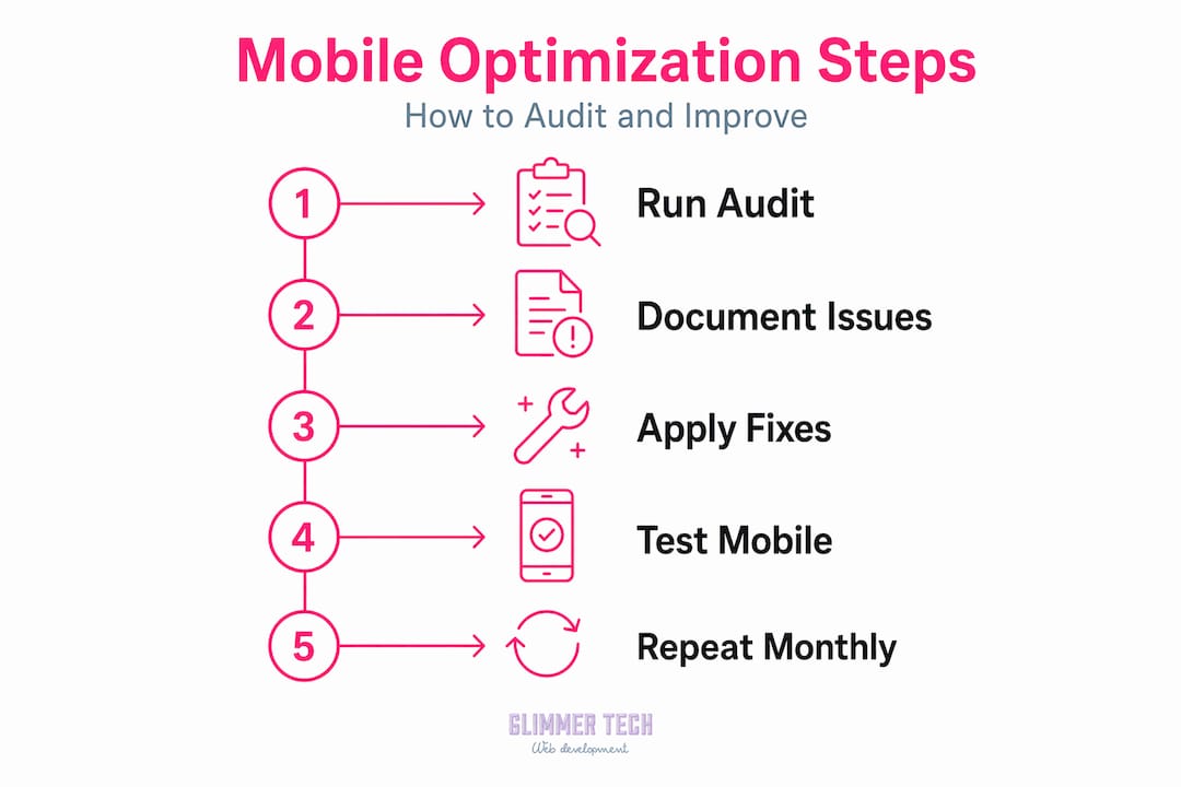
After running your initial audits, document what you find. A simple spreadsheet listing each page, its mobile score, and which Core Web Vitals it fails is enough to prioritize your work and measure progress later.
Step-by-step fixes for mobile performance and user experience
Here is where the actual work happens. Follow these steps in order, since early fixes (especially images) tend to have the biggest impact on construction sites.
-
Convert and compress every image. Construction sites are photo heavy by nature. That is a problem when each project photo is a 4MB file loaded straight from your camera. Compressing and converting images to WebP format cuts file sizes dramatically without visible quality loss. Use the "srcset` attribute in your HTML so mobile devices load smaller versions rather than scaling down a desktop-sized file. This single step often drops LCP by a full second or more.
-
Remove or defer heavy desktop elements. Auto-playing videos on your homepage might look polished on a desktop screen. On mobile, they consume bandwidth and kill load times. The same applies to large background animations or parallax scroll effects. Removing unnecessary heavy components is one of the highest-return changes you can make for mobile users. If you want video on mobile, use a poster image with a tap-to-play option instead.
-
Redesign touch targets for thumbs. Buttons need to be at least 48x48 pixels with enough spacing that a tap hits the right element. Small "Call Now" links crammed into a footer are one of the most common causes of lost leads on mobile. Every phone call or quote request starts with a tap, so make it easy to get right on the first try.
-
Simplify your navigation for small screens. A hamburger menu (the three-line icon that expands a menu) is standard practice for mobile nav. Keep the menu items to five or fewer. Construction mobile user experience suffers when visitors have to dig through dropdowns to find your service areas or contact page.
-
Defer nonessential JavaScript and minimize CSS. Scripts that run before your page content loads delay everything a user sees. In your CMS or with a developer's help, defer scripts that are not needed for initial page display. Minifying CSS files (removing spaces and comments) reduces file sizes without changing how anything looks.
-
Reduce DOM size on portfolio and project pages. Pages with hundreds of photos and nested elements force mobile browsers to process enormous amounts of code. Server-side rendering (SSR) is worth exploring for content-heavy pages. SSR sends a fully built page from the server instead of building it in the browser, which significantly improves LCP and INP on mobile. This is a developer-level task, but it makes a measurable difference for portfolio-heavy construction sites.
-
Set font sizes users can actually read. Text smaller than 16px forces mobile users to pinch and zoom, which is a direct signal to Google that your site has usability problems. Stick to 16px minimum for body text and 18px or larger for anything you want people to actually read without effort.
Pro Tip: After making changes, clear your browser cache and test your site on an actual phone rather than just a desktop emulator. Emulators miss real-world issues like tap delay, font rendering differences, and actual connection speeds.
Common mistakes that break mobile performance
Even well-intentioned improvements can create new problems. These are the mistakes that show up most often on construction sites.
-
Hiding content on mobile to "simplify" the layout. This feels logical but hiding service information or collapsing key details on mobile pages directly hurts your SEO. Google indexes your mobile version and if your mobile page is missing text that your desktop has, those ranking signals disappear. Keep content parity across both versions.
-
Lazy-loading your hero image. Lazy-loading is great for images below the fold. But if you apply it to the first large image a visitor sees at the top of your homepage, you have just told the browser to delay loading your LCP element. That is a fast way to fail the 2.5-second threshold. The hero image should always load eagerly.
-
Missing or incorrect viewport meta tags. Without the line
<meta name="viewport" content="width=device-width, initial-scale=1">in your HTML, mobile browsers do not know how to scale your page correctly. Missing viewport tags are one of the most common technical causes of broken mobile layouts, and they are a one-line fix. -
Testing only on one device. A site that looks correct on an iPhone 15 may break on a mid-range Android phone with a smaller screen. Inconsistent experiences are a common source of lost leads because you never see the broken version.
-
Adding new project photos without re-checking performance. Image-related regressions in LCP, INP, and CLS are common after content updates. Every batch of new photos you upload is a chance to accidentally push your load time back over the threshold. Build a quick post-update check into your workflow.
"A contractor's mobile website is often the first handshake with a potential client. If that handshake is slow or awkward, the conversation ends before it starts."
Verifying and monitoring improvements over time
Fixing issues once is not the same as keeping your site healthy. Here is how to verify your changes actually worked and how to stay on top of performance going forward.
-
Check Google Search Console after each major change. Use the URL Inspection tool to see when Google last crawled a specific page and what it found. The Core Web Vitals report in Search Console shows field data from real users on mobile devices over the past 28 days.
-
Run PageSpeed Insights before and after every update. Document your scores. This creates a record that shows whether changes helped, and it flags new problems introduced by content updates. A before-and-after screenshot takes 30 seconds and saves hours of guesswork later.
-
Use Chrome DevTools for live testing. Open DevTools, click the device toolbar icon, and select a phone model. Then walk through your site as a user would. Submit your contact form. Tap every button. Try the navigation. This reveals real friction points that automated tools miss.
-
Test on physical devices quarterly. Borrow phones from staff or family if needed. A real device on a real mobile connection catches issues that lab testing never surfaces.
-
Schedule a formal audit after redesigns. If you update your site structure, add a new services page, or bring in a new project portfolio section, run a full audit before and after. Redesigns are the most common moment when mobile performance gets quietly broken.
| Monitoring task | Frequency | Tool |
|---|---|---|
| Core Web Vitals check | Monthly | Google Search Console |
| PageSpeed score review | After each content update | PageSpeed Insights |
| Device emulation test | Monthly | Chrome DevTools |
| Physical device test | Quarterly | Real phones |
| Full audit | After redesigns | PageSpeed + Search Console |
My honest take on mobile optimization for construction sites
I have worked with enough construction businesses to spot the pattern: the mobile site is almost always the last thing that gets attention during a website build or redesign. The focus goes to photography, service pages, and local SEO keywords. Then mobile gets a quick check on one device and gets signed off. That approach creates problems that quietly cost leads for months.
What I have learned is that construction business online presence is increasingly a mobile-first problem, not a desktop one. The people hiring contractors search on their phones while they are on a job site, in a parking lot, or between meetings. A slow site is not an annoyance to them. It is a signal that you might not be the right fit.
The other thing I notice is that image-heavy portfolios are the single biggest mobile performance risk in this industry. Showing your work is critical. But every new project you photograph and upload is a potential performance regression if there is no compression process in place. The sites that hold up well over time are the ones where image handling is treated as a standard operating procedure, not an afterthought.
My take is this: choose a platform and development approach where mobile responsiveness is built into the core, not bolted on. If you are considering a site redesign, make mobile performance a requirement from day one, not a post-launch checklist item. The contractors who treat mobile as the primary version of their site are the ones who show up in search and get the call.
— Annie
Get your construction site mobile-ready with Glimmer Tech
If running audits, converting images, and reading Core Web Vitals reports sounds like time you do not have, that is exactly the problem Glimmer Tech solves.

Glimmer Tech builds responsive construction websites designed to perform on every device from day one. Their process covers technical performance, mobile UX, and ongoing monitoring so your site does not quietly degrade after launch. Whether you need a full redesign or a targeted mobile performance fix, the team brings the same performance-focused approach that has produced a 98% client satisfaction rate. See what a properly optimized construction website looks like and talk to the team about where your current site stands.
FAQ
What is construction website mobile optimization?
Construction website mobile optimization is the process of improving how your website performs, looks, and functions on smartphones and tablets. It covers responsive design, page speed, touch-friendly navigation, and meeting Google's Core Web Vitals thresholds for mobile ranking.
Why does mobile optimization affect my Google ranking?
Google uses mobile-first indexing, meaning it crawls and ranks the mobile version of your site rather than the desktop version. If your mobile site is slow, missing content, or hard to use, your rankings drop even if your desktop site is strong.
How do I improve site speed for my construction website?
Start by compressing and converting images to WebP format, removing auto-play videos, deferring nonessential JavaScript, and adding browser caching. These changes typically have the biggest impact on load times for image-heavy construction sites.
What Core Web Vitals score should my construction site hit?
Your site should reach LCP under 2.5 seconds, INP under 200 milliseconds, and CLS under 0.1 to meet Google's 2026 mobile thresholds. PageSpeed Insights shows your current scores for free.
How often should I check my construction site's mobile performance?
Run a Core Web Vitals check monthly through Google Search Console and check PageSpeed Insights scores after every significant content update, especially when you add new project photos or change your site layout.