
A one-page website is a single scrollable webpage that contains all of a business's essential content in one place, eliminating the need for separate pages and directing every visitor toward one clear goal. Also called a single page design, this format has become the preferred choice for freelancers, product launches, event promotions, and small businesses that want a focused online presence without the complexity of a full site. Platforms like WordPress, Wix, and Squarespace all support this format natively. For small business owners who need to get online fast and convert visitors efficiently, the one-page model delivers real results with far less overhead.
What is a one page website and why does it work?
A one-page website works because it removes every distraction standing between a visitor and your call-to-action. Traditional multi-page sites ask visitors to click through menus, explore subpages, and piece together your offer on their own. A single page design does the opposite. It controls the entire experience from the first scroll to the final button.
The format is not a shortcut or a budget compromise. For creators and small businesses, a polished single page functions as a digital business card that communicates credibility instantly. That distinction matters. A well-built one-page site signals professionalism just as effectively as a ten-page site, provided the content is focused and the design is clean.

User attention is concentrated at the top of the page. Failing to engage users early causes high bounce rates on single-page sites. That means your headline, subheadline, and first visual must do serious work. You get one shot at the first impression, and there is no secondary page to recover lost interest.
What are the main benefits of a one page website?
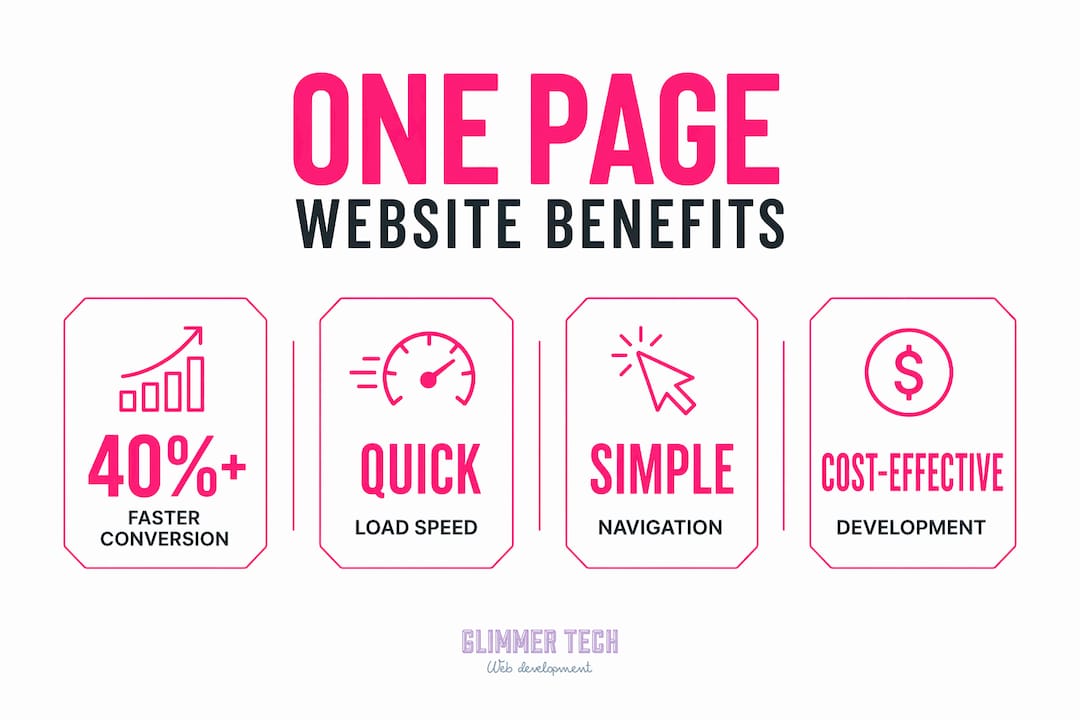
One-page website benefits are most visible in three areas: speed, simplicity, and conversion focus.
Faster load times drive more conversions
One-page sites have a natural performance advantage because they avoid multiple page requests. Pages that load in 1 second can see nearly 40% higher conversion rates, and 88.5% of users abandon slow sites entirely. That is not a marginal difference. Speed is a direct revenue factor, and a single-page architecture keeps your load time low by design.
Simplicity reduces decision fatigue
One-page websites minimize visitor decision fatigue by controlling the information flow and focusing user action on a single goal. When visitors land on your site, they do not choose where to go next. You guide them. That linear experience reduces cognitive load and keeps attention where you need it.
Cost and speed of deployment
Building a one-page website is significantly faster than building a multi-page site. WordPress infrastructure can deploy a site in as little as 47 seconds. For small businesses, that speed-to-market advantage translates directly into faster lead generation. Platforms like Elementor and lnk.boo builder reduce the technical barrier further, letting non-developers launch a professional site in hours rather than weeks.
Pro Tip: Before you build, write your entire page as a single document. If it reads like a clear story from top to bottom, your site structure is ready. If it feels scattered, reorganize the copy before touching any design tool.
Additional advantages of one-page websites include:
- Mobile friendliness. A single scrollable page mirrors how mobile users naturally browse, making the format ideal for smartphone-first audiences.
- Controlled storytelling. You decide the exact sequence in which visitors receive information, which strengthens your narrative.
- Lower maintenance. One page means one set of content to update, one set of images to optimize, and one layout to monitor.
How does a one page website compare to a multi-page website?
The right format depends entirely on what your business needs to communicate. Here is a direct comparison:
| Feature | One-Page Website | Multi-Page Website |
|---|---|---|
| Load speed | Faster, fewer requests | Slower, more HTTP requests |
| SEO potential | Limited, fewer keyword targets | Higher, multiple indexed pages |
| Content volume | Best for focused, single-offer content | Suited for broad, complex offerings |
| User navigation | Linear scroll, anchor links | Menu-driven, non-linear |
| Maintenance effort | Low | Higher |
| Best use case | Portfolios, launches, events, local services | E-commerce, blogs, multi-service businesses |
One-page websites are best for businesses with a narrow focus and a clear call-to-action. Portfolios, product launches, event pages, and single-service local businesses all fit this model well. Multi-page sites suit businesses with broad offerings, diverse audiences, or extensive content needs.
The one area where single page design carries a real limitation is SEO. A single URL can only rank for a limited number of keywords. If your business serves multiple audiences or offers ten different services, a multi-page architecture gives you more room to target specific search terms. You can explore multi-location website structures for a deeper look at when more pages become necessary.
The navigation difference is also worth understanding. Multi-page sites give visitors agency to explore. One-page sites give you control over what they see and when. For conversion-focused goals, control wins. For content-rich businesses, exploration wins.
What are the key design considerations for a one page site?
Effective one-page sites tell a story. Content structured as introduction, pain point, solution, credibility, and call-to-action increases the likelihood of conversion. Failing to structure content logically causes visitor overload and higher bounce rates. The design must support that story at every scroll position.
Anchor navigation and scroll logic
Anchor links are essential for smooth navigation on one-page sites. They let visitors jump to specific sections without reloading the page. A sticky header with anchor links to sections like About, Services, and Contact gives users a sense of orientation even as they scroll through a long page.
Sticky headers require careful technical management. Scroll offset adjustment is a technical requirement when implementing a sticky header and anchor navigation. Without it, anchor links scroll to the correct section but hide the top content behind the fixed navigation bar. Developers use CSS scroll-margin or top padding to correct this. If you are using a builder like Elementor or Wix, check whether your theme handles this automatically.
Copy discipline and visual focus
One-page website copywriting must be highly focused. Every element must push visitors down the conversion funnel because there are no additional pages to educate or inform. That means cutting any sentence that does not serve the goal. Testimonials, trust badges, and a single strong call-to-action belong on the page. Long paragraphs of background information do not.
Poor design or unfocused content on a single page leads to immediate visitor bounce. Visual hierarchy matters as much as copy. Use section breaks, whitespace, and contrasting colors to signal transitions between topics. Proper image optimization also keeps load times low while maintaining visual quality.
Pro Tip: Limit each section to one idea and one visual. If a section is trying to say two things at once, split it or cut one.
How to create your own one page website: step by step
Building a one-page website is straightforward when you follow a clear sequence. Here are the steps that work for small business owners with no prior development experience.
-
Choose your platform. WordPress with Elementor, Wix, and Squarespace are the three most accessible options. WordPress gives you the most control and the widest plugin ecosystem. Wix and Squarespace offer faster setup with less technical overhead. Pick based on how much customization you need versus how fast you want to launch.
-
Plan your sections before you design. Write out your content in this order: Hero (headline and subheadline), About, Services or Offer, Social Proof (testimonials or logos), and Contact. This sequence mirrors the natural decision journey of a new visitor. Rearranging sections later is far easier than rebuilding a design that does not convert.
-
Set up anchor navigation. Assign an ID to each section (for example, "services" or "contact"). Link those IDs in your navigation menu so clicking a menu item scrolls directly to that section. Test every anchor link on both desktop and mobile before publishing.
-
Optimize for mobile. Preview your page on at least two screen sizes before going live. Check that text is readable without zooming, buttons are large enough to tap, and images scale correctly. Responsive design principles apply directly here. A page that looks great on desktop but breaks on mobile loses the majority of your potential visitors.
-
Test, publish, and iterate. Launch with the content you have. Collect real visitor data using Google Analytics or Microsoft Clarity. Watch where users drop off and adjust that section first. A one-page site is easy to update precisely because there is only one page to manage.
Pro Tip: Transitioning a one-page site into a multi-page website later is straightforward. You add new pages and update the navigation. Build your one-page site now and scale when your business demands it.
Key takeaways
A one-page website converts more effectively than a multi-page site when your business has a single, focused offer and a clear call-to-action.
| Point | Details |
|---|---|
| Speed drives conversions | Pages loading in 1 second see nearly 40% higher conversion rates, making fast load times a business priority. |
| Structure content as a story | Use the introduction, pain point, solution, credibility, and call-to-action sequence to guide every visitor toward conversion. |
| Anchor navigation is non-negotiable | Sticky headers with anchor links keep users oriented and reduce bounce on long scrollable pages. |
| One-page sites have SEO limits | A single URL targets fewer keywords, so businesses with broad offerings may need a multi-page architecture instead. |
| Scalability is built in | A one-page site can grow into a multi-page site by adding pages and updating navigation when your business expands. |
Why i think most small businesses start with the wrong website
I have reviewed hundreds of small business websites over the years, and the pattern is consistent. A business owner hires someone to build a ten-page site, spends three months on it, and launches with half the pages still empty. The "Our Team" page has one person. The blog has two posts from the launch week and nothing since. The services page lists everything the business has ever done, formatted as a wall of text.
That is not a website problem. That is a scope problem. The business did not need ten pages. It needed one good page with a clear offer and a phone number.
The one-page format forces a discipline that most businesses benefit from. You cannot hide behind a navigation menu. You cannot defer the hard decisions about what your business actually does and who it serves. Everything has to be on the page, in order, earning its place.
The businesses I have seen get the most out of single page design are the ones that treat it seriously. They write real copy. They use real photos. They test the page on their own phone before they show it to anyone. The format rewards that effort directly because there is nowhere else for the quality to go.
My honest advice: if you are launching a new business or relaunching an existing one, start with one page. Get it right. Then add pages only when a specific business need demands it, not because you think more pages means a more legitimate business. It does not. A focused, well-built one-page site outperforms a bloated multi-page site almost every time.
— Annie
Ready to launch your one page website with glimmer tech?
Glimmer Tech builds one-page websites that are fast, focused, and built to convert. Small business owners and entrepreneurs get a tailored design process that skips the guesswork and delivers a site ready to generate leads from day one.
Glimmer Tech's team handles everything from copy structure and anchor navigation to mobile optimization and load speed. You bring the business. Glimmer Tech brings the build. With a 98% client satisfaction rate and a track record of successful launches, the process is straightforward and the results are measurable. Visit Glimmer Tech's web services to see what a focused, conversion-ready one-page site looks like for your business.
FAQ
What is a one page website used for?
A one-page website is used for portfolios, product launches, event pages, and single-service local businesses where a focused message and one clear call-to-action are more effective than a multi-page structure.
Does a one page website hurt SEO?
A single page website limits SEO because one URL can only target a limited number of keywords. Businesses with broad offerings or multiple services typically need a multi-page site to rank across different search terms.
How long does it take to build a one page website?
With platforms like WordPress and Elementor, a one-page website can be deployed in hours. WordPress infrastructure can launch a basic site in as little as 47 seconds, making it one of the fastest ways to get a business online.
Can a one page website grow into a multi-page site later?
Yes. Transitioning a one-page site into a multi-page website is straightforward. You add new pages and update the navigation accordingly, so starting with one page does not limit your long-term options.
What sections should a one page website include?
An effective one-page website should include a hero section, an about section, a services or offer section, social proof such as testimonials, and a contact section with a clear call-to-action.