
User experience web design is the practice of crafting websites that feel intuitive, satisfying, and effective for every person who visits them. Known in the industry as UX design, it covers far more than how a site looks. UX encompasses usability, user expectations, and the emotions visitors feel while completing tasks. Tools like Figma, methods like wireframing and usability testing, and frameworks from IBM and Nielsen Norman Group all feed into this discipline. For web designers and small business owners alike, strong UX design is the difference between a site that converts and one that drives visitors away.
What is user experience web design and why does it matter?
User experience web design is the structured process of designing websites around user needs, behaviors, and goals rather than around visual preferences alone. IBM defines UX design as a structured, user-focused process that includes research, information architecture, wireframing, prototyping, and testing to create frustration-free interactions. That definition matters because it positions UX as a methodology, not just an aesthetic choice.
The scope of UX design for websites covers three interconnected layers. First, there is functional usability: can visitors find what they need and complete tasks without confusion? Second, there is emotional satisfaction: does the experience feel trustworthy, clear, and worth returning to? Third, there is business alignment: does the site guide users toward the actions that matter to your organization?

Figma describes UX design as focusing on the end-to-end user journey rather than individual pages. This means a well-designed contact form on an otherwise confusing site still represents a UX failure. The journey from landing page to task completion must hold together as a whole.
For small business owners, this has a direct financial implication. A site that frustrates visitors at any point in the journey loses conversions. For web designers, it means every decision, from navigation structure to button placement, must be grounded in how real users think and move through a site.
Core principles and components of UX design
The principles that define strong UX design are consistent across industries and site types. Understanding them gives you a framework for evaluating any website objectively.
Usability is the foundation. A site is usable when visitors can accomplish their goals efficiently and without unnecessary effort. This includes clear labels, predictable navigation, and forms that do not require guessing.
Accessibility extends usability to all users, including those with visual, motor, or cognitive differences. Inclusive web design is not optional. It expands your audience and, in many jurisdictions, carries legal weight.
Emotional engagement is where UX separates itself from pure functionality. UX builds emotional trust through thoughtful journey planning, not just efficient task completion. A site can be technically usable but still feel cold, confusing, or untrustworthy.
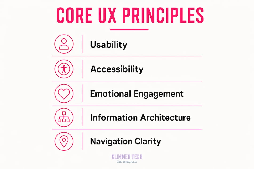
Information architecture determines how content is organized and labeled. Poor architecture forces users to hunt for information, which raises bounce rates and kills conversions.
Navigation clarity ties directly to architecture. Users should always know where they are, where they can go, and how to get back. Clear website navigation is one of the highest-leverage improvements any site can make.
The separation between UX and UI (user interface) design is worth naming here. UI covers the visual elements: colors, typography, buttons, and layout. UX covers the functional flow and whether those elements actually serve the user's journey. Both matter, but confusing them leads to teams that polish visuals while ignoring broken flows.
Pro Tip: Before redesigning any page, map the user's goal for that page in one sentence. If your design does not serve that goal directly, it needs to change.
How does UX differ from UI design and usability testing?
This is the question that causes the most confusion on design teams, and getting it wrong wastes time and budget.
UI is what users see. UX is how those elements make users feel and whether they perform correctly within the journey. A beautifully designed button is a UI decision. Placing that button where users expect to find it, with copy that matches their intent, is a UX decision.
Usability is a component of UX, not a synonym for it. Usability measures task success: can a user complete a specific goal? UX is broader. It includes the emotional response before, during, and after that task. A site can score well on usability tests and still deliver a poor overall experience if it feels impersonal or creates anxiety.
Jakob Nielsen's 10 usability heuristics are a widely used audit framework within UX work. They cover principles like visibility of system status, error prevention, and recognition over recall. Heuristic evaluations are fast and useful for spotting obvious problems, but real user testing is needed to prioritize meaningful fixes and avoid false positives from expert assumptions.
Here is a direct comparison of the three concepts:
| Concept | Focus | Primary method | Scope |
|---|---|---|---|
| UX design | Full user journey and satisfaction | Research, prototyping, testing | Broad: emotional, behavioral, functional |
| UI design | Visual and interactive elements | Visual design, component libraries | Narrow: appearance and interaction |
| Usability testing | Task completion and error rates | Observation, think-aloud protocols | Specific: can users accomplish goals? |
The practical takeaway: UI without UX produces beautiful sites that confuse users. Usability testing without broader UX thinking catches task failures but misses emotional friction. All three work together, but UX is the governing discipline.
What processes create excellent web UX?
Strong UX design follows a repeatable process. The specific tools vary, but the sequence is consistent across teams at Google, Airbnb, and small agencies alike.
-
User research. Start by understanding who your users are, what they need, and where they currently struggle. Interviews, surveys, and analytics data all feed this phase. Skipping research means designing for assumptions, not people.
-
Information architecture and wireframing. Before any visual design begins, map the site's structure and user flows. Website wireframes let you test navigation logic and content hierarchy without the distraction of color or typography. Figma and tools like Balsamiq are standard here.
-
Prototyping. A clickable prototype lets stakeholders and test users interact with the design before a single line of code is written. This is where flow problems surface cheaply.
-
Scenario-driven usability testing. Scenario-driven testing yields more specific insights by asking users to complete realistic tasks rather than explore freely. Watching a user try to find your pricing page tells you far more than asking them if the site looks good.
-
Iterative refinement. Iterative UX design involves repeated rounds of testing, identifying where users struggle, and revising without introducing new problems. One round of testing is never enough.
-
Performance and accessibility review. Page speed, mobile behavior, and accessibility compliance are UX factors, not just technical ones. Image optimization and mobile performance directly affect how users experience your site.
IBM describes this as an evidence loop: gather goals, test for hesitation points, restructure navigation, then apply UI polish. The order matters. Teams that start with visual polish and add testing later consistently miss structural problems that cosmetic changes cannot fix.
Pro Tip: Run usability tests with draft content, not just finished copy. Early testing with draft content catches navigation and comprehension issues before the build is complete, saving significant rework costs.
Why UX design matters for business outcomes
UX quality connects directly to customer satisfaction, retention, and conversion rates. This is not a soft claim. It is the mechanism behind why some websites generate leads consistently while technically similar sites do not.
The business-critical elements of web UX break down into three areas:
- Navigation and findability. Users who cannot find what they need within a few clicks leave. Simplified, logical navigation reduces this friction and keeps visitors moving toward conversion.
- Call-to-action clarity. A CTA that uses vague language or sits in an unexpected location loses clicks. UX design treats CTA placement as a journey decision, not a visual one.
- Page performance. Slow load times are a UX failure. Users abandon pages that take more than a few seconds to load, regardless of how well-designed the content is.
Practical improvements you can make today include auditing your primary navigation against real user paths, testing your site on mobile devices with average connection speeds, and running a five-second test to see what visitors actually notice first on your homepage.
For small businesses, the stakes are especially clear. Web design's impact on business is measurable in leads, sales, and customer trust. A site that delivers a poor experience signals poor service before a single conversation happens.
Key takeaways
User experience web design succeeds when research, iterative testing, and journey-focused structure work together before visual design begins.
| Point | Details |
|---|---|
| UX is broader than UI | UX covers the full user journey and emotional response; UI covers visual elements only. |
| Usability is one part of UX | Task completion testing measures usability, but UX also includes emotional engagement and trust. |
| Process order matters | Research and wireframing must precede visual design to avoid fixing structural problems with cosmetic changes. |
| Early testing saves money | Testing with draft content catches navigation failures before the build is complete. |
| UX drives business results | Navigation clarity, CTA placement, and page speed directly affect conversion rates and customer retention. |
What I've learned from watching teams get UX wrong
I have seen the same mistake repeated on projects of every size: teams spend weeks refining typography and color palettes while the navigation structure is still broken. The visual layer gets polished before anyone has watched a real user try to find the contact page.
The UX and UI confusion is not just semantic. It creates real team dysfunction. Developers wait on visual specs while the information architecture is unresolved. Clients approve mockups that look great but hide structural problems. Then the site launches, bounce rates are high, and everyone blames the copy.
What actually works is running even a rough usability test on a wireframe before any visual design is approved. Five users completing three realistic tasks will surface more problems than a week of internal review. The evidence is not subtle. You watch someone click the wrong thing three times in a row, and the fix becomes obvious.
The emotional dimension of UX is the part most often skipped in briefs and proposals. A site can pass every usability heuristic from Jakob Nielsen's list and still feel cold or untrustworthy. Emotional engagement comes from tone, pacing, and the sense that the site was built for the specific person using it. That requires knowing your users, not just your brand.
My honest recommendation: treat UX as a discovery process, not a deliverable. The goal is not a finished document. It is a site that keeps improving because you keep watching how people use it.
— Annie
How Glimmer Tech can improve your site's user experience
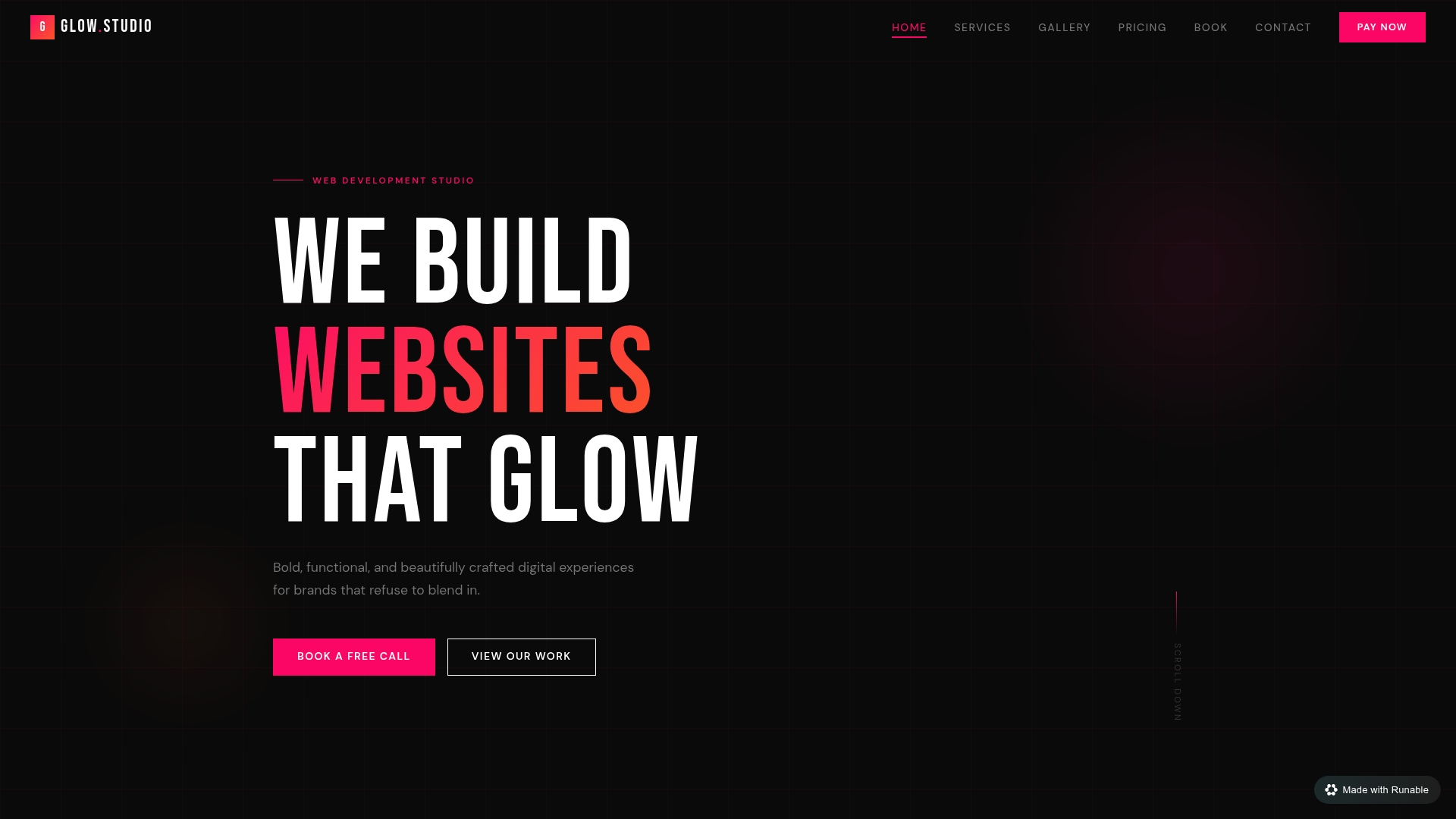
Glimmer Tech builds websites where UX is the starting point, not an afterthought. Every project begins with understanding your users' goals and mapping the journey before a single visual element is designed. The result is a site that looks sharp and actually converts.
Glimmer Tech's services cover UX-focused web design and development, usability audits for existing sites, and performance optimization that removes friction at every stage of the user journey. Whether you are launching a new site or improving one that is underperforming, Glimmer Tech brings the process and the evidence-based approach that turns visitors into customers. With a 98% client satisfaction rate, the results speak for themselves.
FAQ
What is UX design in simple terms?
UX design is the process of building websites and digital products so they are easy, intuitive, and satisfying to use. It covers everything from navigation structure to how users feel after completing a task.
How is UX different from UI design?
UI design focuses on the visual elements of a site, such as buttons, colors, and typography. UX design covers the full user journey and whether those elements actually help users accomplish their goals.
Why does user experience matter for small business websites?
Poor UX drives visitors away before they convert. IBM connects UX quality directly to customer retention and conversion rates, making it one of the highest-return investments a small business can make in its website.
What tools are used in UX design for websites?
Common tools include Figma for wireframing and prototyping, Balsamiq for low-fidelity wireframes, and usability testing platforms for scenario-driven research. Jakob Nielsen's heuristics are a standard audit framework used alongside these tools.
How often should you test your website's UX?
UX testing should be iterative, not a one-time event. Digital.gov recommends repeated rounds of scenario-driven testing to catch new issues introduced during revisions and to confirm that fixes actually resolve the original problems.